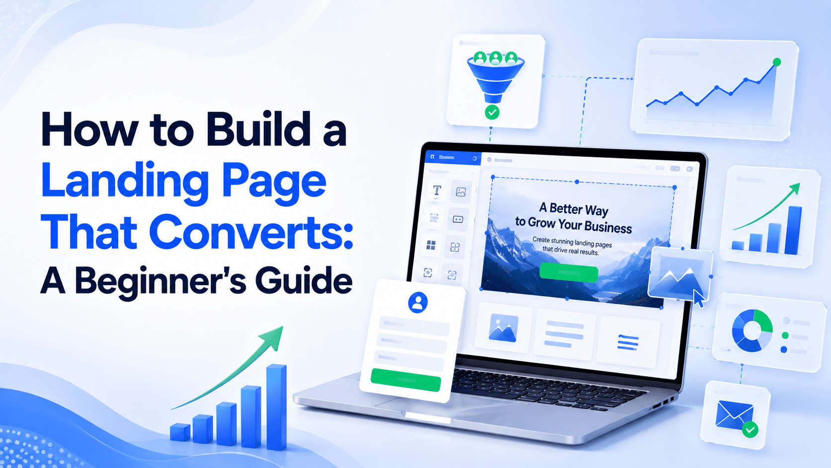
A landing page that converts is not the one with the prettiest design. It is the one that turns visitors into leads and buyers.
Most beginners obsess over colors and fonts, then wonder why nobody signs up. The real winners nail the message, the flow, and the single action they want people to take.
Here is the encouraging part. The median landing page converts at 6.6%, while the best pages reach 10% or higher (Unbounce, 2026).
That gap almost never comes from more traffic. It comes from smarter copy, cleaner design, and a clear call to action. All three are things a beginner can fix this week.
This guide breaks down what makes a page convert, why it matters for your sales, and the exact steps, copywriting tips, and call to action examples you can copy today.
Uncover My Top Recommendation for Making $100-$300 Daily – Check Out This FREE Video to Begin >>>
What Is a Landing Page That Converts?
A landing page that converts is a single web page built to turn visitors into leads or customers by guiding them toward one clear action.
That action might be joining an email list, buying a product, or booking a call.
Unlike a homepage full of menus and links, a converting page removes distractions. It carries one message and one goal, so the visitor knows exactly what to do next.
A high-converting page usually has these parts working together:
- A clear headline that states the main benefit.
- A short subheadline that adds proof or detail.
- One focused offer with no competing choices.
- A strong call to action that tells people what to click.
- Trust signals like reviews, photos, or a guarantee.
Why a High-Converting Landing Page Matters
Traffic costs money and effort, so wasting it hurts. If your page converts at 2% while a rival’s converts at 8%, they earn four times the sales from the same visitors.
Same clicks, very different results.
The numbers show how much design and copy matter. Dedicated landing pages convert 2 to 3 times higher than generic pages, because they match the visitor’s intent and cut the clutter (CorePPC, 2026).
Traffic source matters too, since email visitors convert far better than paid search visitors landing on the same page.
Here is why building a page that converts pays off:
- More sales from the same traffic. Small tweaks compound into real revenue.
- Lower cost per lead. A higher conversion rate stretches every marketing dollar.
- Faster testing. One focused page shows you clearly what works.
- Better data. Clean pages give clean numbers you can learn from.
How to Build a Landing Page That Converts: Step-by-Step
Follow these steps in order. None of them needs a designer or a big budget.
Step 1: Write One Clear, Benefit-Led Headline
Your headline is the first thing people read, so make it about their win, not your product. Compare “Our Email Course” with “Write Emails That Get Replies in 5 Days.” The second one promises a result, and results sell.
Step 2: Keep One Goal and One Action
Pick a single goal for the page. Signup or sale, not both. Remove your navigation menu, extra links, and anything that pulls attention away. One page, one job.
Step 3: Show the Offer’s Value Fast
People skim, so put your main benefit and button near the top. Use short lines and simple words. Explain what the visitor gets and how it helps them, not just what it is.
Step 4: Add Trust Signals
Doubt kills conversions. Calm it with a short testimonial, a real photo, a number of happy customers, or a simple money-back promise. Even one honest review lifts trust.
Step 5: Make It Load Fast and Work on Mobile
Mobile pages convert about 40% lower than desktop already, so a slow phone experience is costly (Visionary Marketing, 2026). Compress your images, keep the layout simple, and preview the page on your phone before you publish.
Uncover My Top Recommendation for Making $100-$300 Daily – Check Out This FREE Video to Begin >>>
Landing Page Copywriting Tips for Beginners
Good copy does the heavy selling. These landing page copywriting tips work even if you have never written a word for the web.
- Speak to one person. Use “you” and write like you are talking to a friend.
- Lead with benefits, back with features. Say what they gain first, then how it works.
- Cut filler words. Short sentences read faster and keep attention.
- Match the promise. Your headline and your offer must line up, or trust drops.
- Handle one objection. Answer the biggest “but what about…” right on the page.
Call to Action Examples That Get Clicks
Your button text can make or break the page. Vague buttons like “Submit” leave people cold. These call to action examples give the visitor a reason to click:
- “Send Me the Free Guide” for a lead magnet.
- “Start My Free Trial” for software.
- “Get 20% Off Today” for a time-limited deal.
- “Book My Free Call” for a service.
- “Yes, I Want More Sales” for a benefit-led offer.
Notice the pattern. Each one is written from the visitor’s point of view and names the reward.
Common Landing Page Design Mistakes to Avoid
Most beginner pages fail for the same few reasons. Fix these landing page design mistakes first:
- Too many links and buttons. Every extra choice lowers your conversion rate.
- A weak or clever headline. Clear beats clever. Say the benefit plainly.
- Long forms. Ask for the email only. Trim every field you can.
- No trust signals. Add a review, a photo, or a guarantee to ease doubt.
- Slow load times. Heavy images and clutter push visitors away.
- Ignoring mobile. Always preview and fix the phone version.
- Hidden call to action. Keep the main button visible without scrolling.
Pro Tips and Advanced Insights
Once your page works, these moves take it further. This is where conversion rate optimization, the practice of testing and improving pages, starts to pay real money.
- Test one thing at a time. Change the headline, measure, then change the button. Single changes give clear answers.
- Try a video. A short explainer often lifts conversions for products people need to see in action.
- Add urgency honestly. A real deadline or limited bonus nudges action without tricks.
- Match your traffic. The ad or post that sent the visitor should echo the page headline.
- Watch your numbers. Track visits and conversions weekly so you spot what works and repeat it.
FAQs
What is a landing page that converts?
A landing page that converts is a focused page built to turn visitors into leads or customers through one clear message, one offer, and one strong call to action, with no distractions.
What makes a landing page convert better?
A clear benefit-led headline, a single action, trust signals, fast load speed, and mobile-friendly design make a landing page convert better. Focus beats clutter every time.
What is a good landing page conversion rate?
The median landing page converts at about 6.6%, and top pages reach 10% or higher (Unbounce, 2026). A good rate depends on your industry and traffic source, so track your own trend.
What are the best landing page copywriting tips?
Write to one person, lead with benefits, cut filler words, match your headline to your offer, and answer the visitor’s biggest objection right on the page.
What is a good call to action?
A good call to action names the reward and speaks from the visitor’s view, such as “Send Me the Free Guide” or “Start My Free Trial,” instead of a flat “Submit.”
What is conversion rate optimization?
Conversion rate optimization is the practice of testing and improving a page so more visitors take the action you want. Small, tested changes add up to more leads and sales over time.
What are common landing page design mistakes?
Common mistakes include too many links, a vague headline, long forms, missing trust signals, slow load times, and hiding the call to action below the fold.
Uncover My Top Recommendation for Making $100-$300 Daily – Check Out This FREE Video to Begin >>>
Conclusion: Turn Your Page Into a Selling Machine
You now have a clear plan for a landing page that converts, from a benefit-led headline to sharp copy, click-worthy buttons, and the design fixes that keep visitors moving toward one action.
Better pages do not need bigger budgets. They need focus.
Open your current page and check it against this guide. Fix the headline, cut the clutter, and rewrite your button today.
Ready to convert more visitors? Pick one section of your page, apply a fix from this guide, and test it this week. Small changes today turn into more leads and sales tomorrow.